Quick and Easy Site Optimizations You Can Do Today... Accessibility Edition
Written by Dr Leimar Garcia-Siino | Independent Researcher & Editor
There are thousands of SEO guides out there on how to optimize your website. Some promise you easy fixes and quick wins and some are so long you feel you’ve been assigned The Odyssey and the test is tomorrow—gulp!

Most quick optimization guides will tell you to optimize your keywords, and to fix your meta description, and to make sure your headers are in order. All of that is true, and it’s part of building a good website that attracts clients, readers, and all kinds of users.
But that’s not what this guide is about.
Today, we’re going to talk about accessibility.
Specifically, FIVE accessibility optimizations you can implement yourself:
Add alt-texts for images
Check for color contrast and readability (fonts, sizes, and spacing)
Test keyboard inputs
Ensure scannability
Optimize for AI visibility through W/H questions
These are all doable with limited web-building knowledge, and they give you a stepping stone for more in-depth improvements later. This guide is designed so you can either make these optimizations yourself or you can send this to your website manager or your boss and say “Ooh, we should make sure we’re doing these!”
What is web accessibility?
Web accessibility means ways to make a website, well, accessible. In other words, making sure it can be accessed—that it can be used for its intended purpose—by as many people as possible.
Imagine you need to get into a place of business, but the door doesn’t open. That makes it inaccessible. Imagine the door could open, but it weighs 300 pounds. Now it’s only accessible to someone who can push a 300 lb door.
Accessibility means we all can come in. And if you’re a business owner or a service provider, the more people can come in and interact with your website, the better your business.
So, how do you do it?
Well, in... a few different [and often annoyingly technical!] ways, but here are five things you can do that require almost no technical skills or web-building or SEO knowledge.
The Five Quick Accessibility Optimizations:
Adding Alt-Text to Your Images
So, you have images on your website. That’s excellent. You’re showcasing your menu, or your services, maybe you have photos of your team, or you have lovely hero images.
But if you are a visitor with a visual impairment, you might not be able to see any of these images. And if you’re using assistive technology like a screen reader, and the images have no alt-text... then you’ve been blocked from appreciating the visuals completely.
An “alt-text”, short for “alternative text”, does just that: provides a text-based alternative for elements that are not text-based. With it, a blind or low-vision client or visitor using your website can experience and access the same information as a sighted one.
Bonus: You pass one of the ADA accessibility requirements, and the use of keywords and descriptions for images actually helps search engines like Google and generative systems like the AIO and AI apps understand your images and content better!
How do you add alt-text to your images
Log into your content management system.
Go to each of your pages in the editor mode.
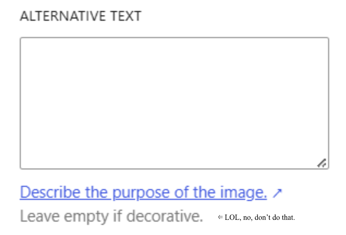
Click each image—all of them! Your logo, your icons, the photos for background, headshots, product images, drawings, screenshots. All. Of. It.—and look for an input box like this:
4. Describe the image! Hmm… But how?...
How to write alt-text
Look at the image and answer:
What is this? Like, literally... what is it? It’s not just a photo or an image; what’s on it?
What’s its purpose? Is it a product photo? Is it representing something like an idea, a metaphor, an instruction, a feeling, a vibe?
Now, you’re not necessarily writing that on the alt-text box. But it helps you identify what to write.
For example, look at one of my favorite alt-texts on Layshi Curbelo’s home page :
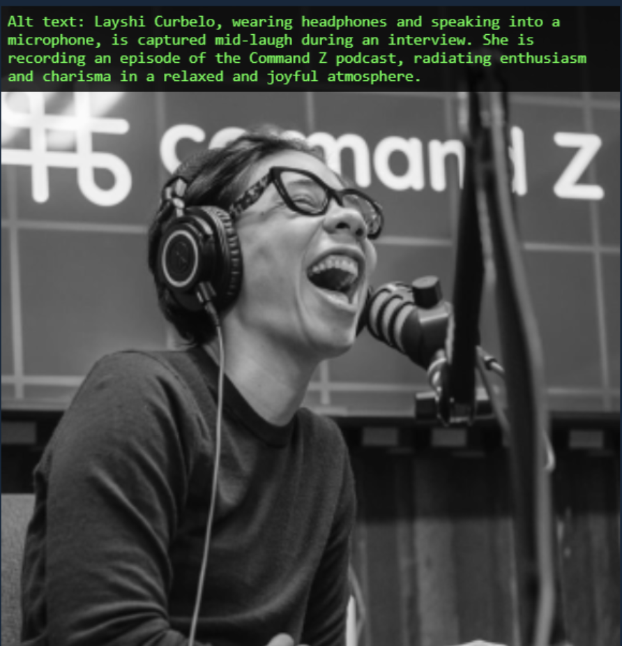
A barebones alt-text could have said: “A person laughing” or “A photo of a person laughing”.
A more intentional alt-text would be: “Layshi Curbelo laughing while wearing headphones and speaking into a microphone.”
But think about what the actual alt-text that was used is doing:
It doesn’t just say what’s in the photo.
It also gives context: “captured mid-laugh”. Why? Because that’s what a sighted person would interpret.
It also includes that this is during a recording of the Command Z podcast. Why? Because you can see the logo of the podcast in the back. Again, that’s information a sighted person would be able to interpret.
And then it adds, “radiating enthusiasm and charisma in a relaxed and joyful atmosphere,” because that’s the emotion the photo is imparting, and it’s being used on the homepage to convey collaboration, friendship, and welcoming.
That means that a person using a screen reader will have access to the information the image is intended to convey: what’s happening, the context, the emotions.
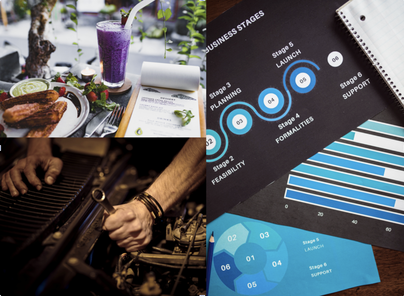
How would you describe these images? Think about the alt-text you would write and then see what we wrote using the “View Alt Text” Chrome Extension, or by adding this link to your bookmarks bar.



Check for Color Contrast and Readability
While on the subject of vision, not everyone with eyesight sees in the same way either! The colors, font styles, and text sizes you use can reduce access for some users.
Some of us are color blind (and there are several different kinds of color blindness); some of us have glaucoma, cataracts, astigmatism, or farsightedness; and some of us have cognitive learning disabilities like dyslexia or dysgraphia. All of these can affect how much users can ‘see’ of your website.
Color Blindness
There are about 300 million people with some kind of color blindness (nearly 4% of the population), and it affects men at a higher ratio than women (1 in 12 men are affected versus 1 in 200 women).
Websites that don’t account for color blindness when picking their color scheme or when creating images, icons, and graphics can result in color-blind users being unable to interact successfully with the website.
What to do:
Check what your page(s) look like for users with different kinds of color blindness. You can use this page to test it out: Colorblind Web Page Filter. Ask yourself:
Can you read everything on the different filters?
Can you understand the images?
Can you see the buttons?
Don’t rely solely on color for information. This is particularly important for graphics that convey important information. Never use color as the only option for understanding.
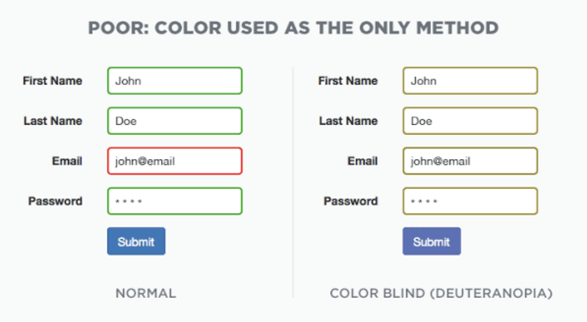
Crux Collaborative has a great example of this. Look at this form where the only indicator of an error is a red outline. A color blind user would have a very hard time figuring out what’s wrong!
Make sure there’s always additional information like “(x)” or “incomplete” or “missing” that conveys meaning beyond just color differences.
Other Classic Examples:
Subway maps (full color vs grayscale)

That NFL 2015 game where the teams’ colors were red and green (full color vs protanopia)

Color Contrast
Here’s a question What’s the difference between hot pink, magenta, and fuchsia? Or between aqua, bluebird, teal, and turquoise?
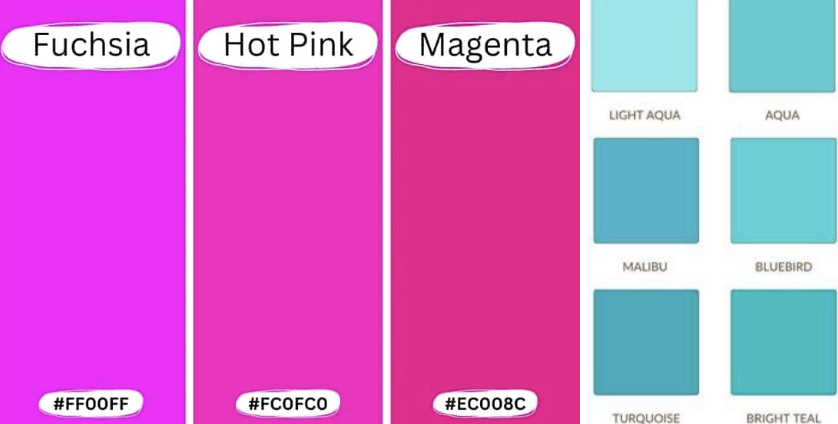
If you answered “not much,” you’d be correct. Colors are a beautiful thing, but when they’re too similar to each other—when they have low contrast (low difference)—it can be hard for users to see differences.
Maybe you set out to have a lovely gentle color palette, but you end up with something that, while pretty, is difficult to read, difficult to look at, and difficult to base decisions on, especially when you have low and/or blurry vision.
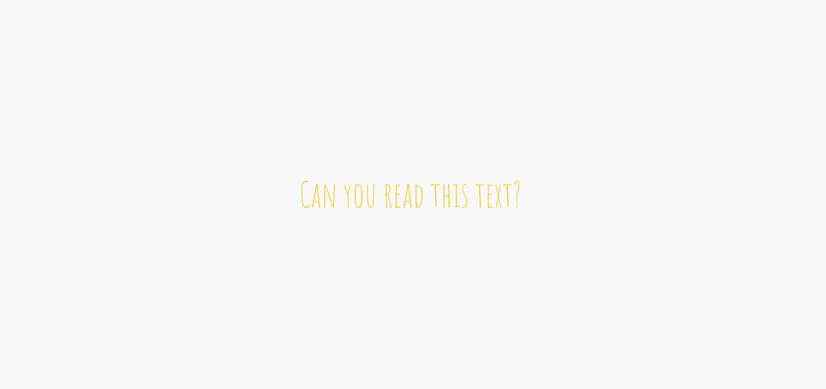
Believe it or not, that’s the color scheme on a public business website right now. This kind of contrast mistake—where the difference between two colors is low—is unfortunately all too common.
Thankfully, you can use a tool like this to check the color contrast on your page. Test the contrast between your background and your foreground, between your text and your background, and between elements that are supposed to convey different information (like “Add to Cart” and “Next” buttons!):
Using WebAim’s “Color Picker” tool, check the contrast between your foreground elements (like text) versus your background elements:
2. If you have small/normal text and it doesn’t pass the contrast test, make the text bigger and/or lighter/darker, or make your background lighter/darker, depending on your need. You typically need a contrast ratio of at least 7:1.
Font Styles and Sizes
Fonts can convey a lot of personality and style. Maybe you want your website to feel fun and fancy free, or you want to convey a sense of professionalism and customer service, or you want an air of mystery and adventure.
Whatever the vibe you’re going for, however, your text needs to be legible. Fun with fonts is great until you end up with things like this:
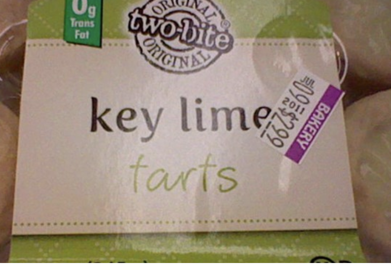
Your font shouldn’t result in readers going “What… do they mean?” especially when they’re trying to get a service, buy something, learn something, or manage financial or medical things.
On top of it, for visitors with learning disabilities like dyslexia and dysgraphia, with neurodevelopmental conditions like ADHD, and with low vision, non-standard fonts introduce an additional level of decoding. They require more focus, more time, and more effort to read, and can lead to misunderstandings and missed information.
Font styles to avoid or replace if you’re already using them:
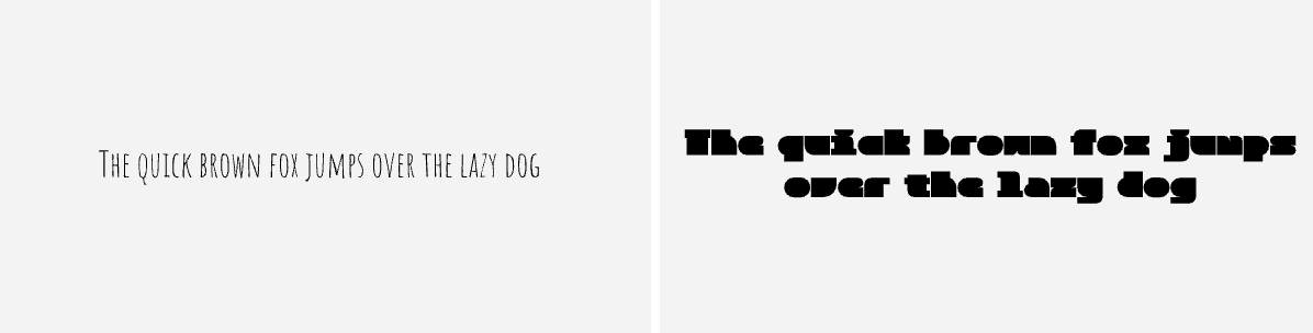
Super thin or super blocky fonts
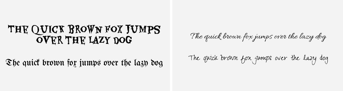
Distorted or highly-stylized fonts
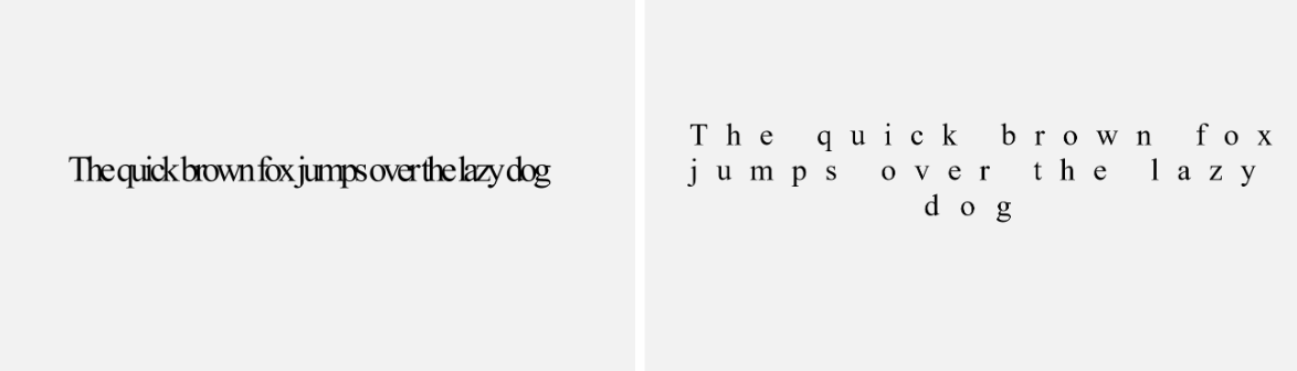
Fonts with little spacing or too much spacing (sidenote: don’t justify text; that’s also harder to read!)
Test Your Website’s Keyboard Inputs Work
Did you know that computers (when done right) are made so you can navigate them completely without using a mouse or cursor?
A lot of the time, this conjures up visions of nerds coding Matrix-style text, their fingers typing lightning-fast on a clacking keyboard. Their hand never moves to the mouse; they can do it all with just a few keystrokes!
Well, turns out that’s actually doable. You can test it right now by using a combination of Arrow keys, the Tab key, the Space Bar, and Enter:
The Arrow keys let you go up and down a page just like the scroll wheel on the mouse.
The Space bar moves you even faster down a page.
The Tab key lets you select elements one by one.
Enter lets you click on elements.
This functionality is also an important feature for users with limited mobility who use assistive technology. Instead of using a mouse or cursor to click on elements on a screen or scroll down a page, they can use the same keyboard commands to navigate the interface.
How you know it’s working (and find out what’s not working):
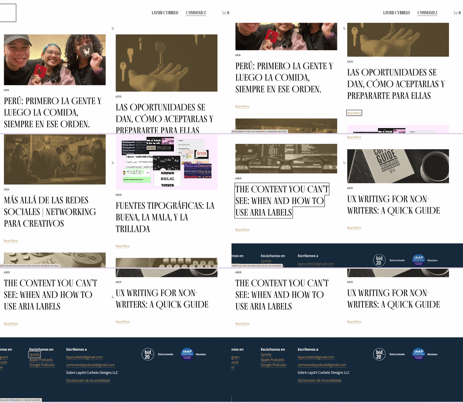
Open a page on your website (like your homepage) and start tapping “Tab.” If it’s working correctly, you should be able to see a square outline around each element on the page, and you should be able to press Enter on them.
How to fix keyboard inputs when they’re missing:
Fair warning: This might be the most technical optimization in this article.
What you’ll need:
Access to your website’s theme customizer where you can input CSS
The CSS code
Do the following:
If your website is built using Wordpress themes, go to “Appearance” and then “Customize.”
Find the option that says “Additional CSS”; it should be at the very bottom of the options list.
Paste this code:
a:focus-visible, button:focus-visible, input:focus-visible, select:focus-visible, textarea:focus-visible {
outline: 3px dashed #007cba !important;
outline-offset: 2px !important;}
Hit “Publish” and check your page by hitting Tab throughout your pages.
In most cases, this will solve the missing outlines problem and give you a simple dotted-line outline around all of your clickable elements.
For more stylized options, and for buttons and elements where this doesn’t work, you will need more specialized knowledge and support.
Ensure Your Content is Scannable
Scannability means content you can “scan” through easily.
Straightforward sentences are easier to read and they are interpreted faster by most readers.
Meanwhile, and conversely—as would be expected—sentences that are constructed utilizing more complex syntactic, semantic, and lexical formats render those sentences harder to parse, particularly by a readership unaccustomed to verbosity.
Like that.^
When you combine everything you’ve learned in this article so far, you can tell why scannability is important for accessibility.
Scannability does not mean simplistic. You do not and should not “dumb down” hard information or take out complex words.
You’re just making it accessible to more people.
Bonus: It’s proven that content that is readable and scannable lowers bounce rates and increases engagement, which leads to increased CTR and conversions!
Ways to make content scannable:
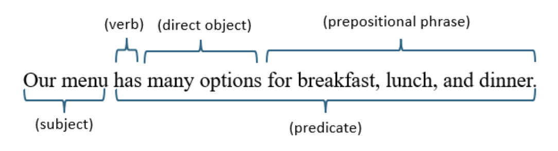
Keep sentences “simple”. Familiar sentence structures—especially ones that introduce the subject before describing the action—are generally easier to follow.
That kind of structure helps readers follow along from who is doing something or who needs to do something, all the way to what they do, how they do it, when they do it, etc.
Look at these two examples:
Simple construction:
“Our menu has many options for breakfast, lunch, and dinner.”
VS.
“Whether you’re hungry for dinner, breakfast, or lunch, on our menu you’ll find something that strikes your fancy.”
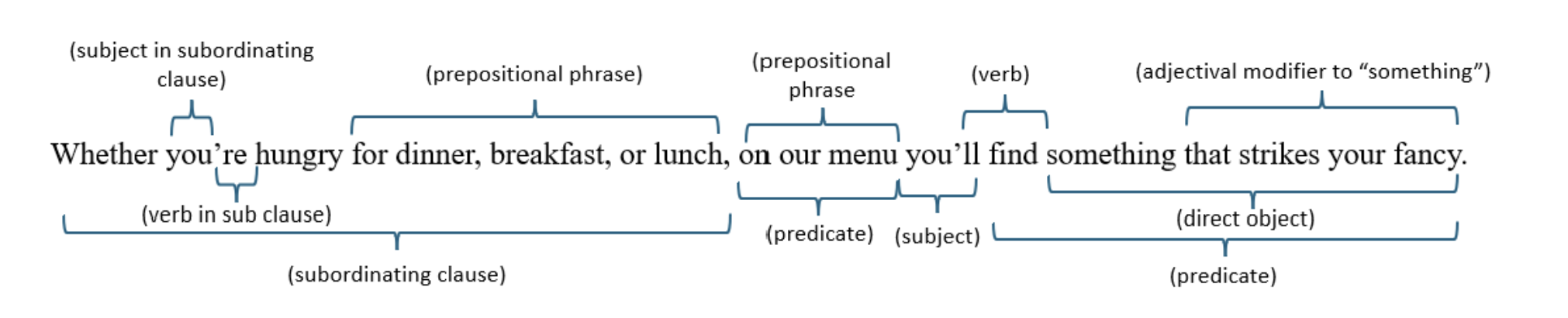
The first says what it needs to say directly—to the point. The second is convoluted.
And that happens a lot; we all get carried away sometimes because writing can be fun. But let’s always remember that door: don’t make it so heavy that people can’t access your business.
Keep paragraphs to around five lines or less:
The denser a paragraph is—the more lines it has—the harder it is to keep track of where you’re reading and the harder it is to scan through.
When we scan text, we’re not reading every single word or every single letter. Our eyes are looking for the important bits of information.
Think about the line above; a lot of readers probably read it a little like this:
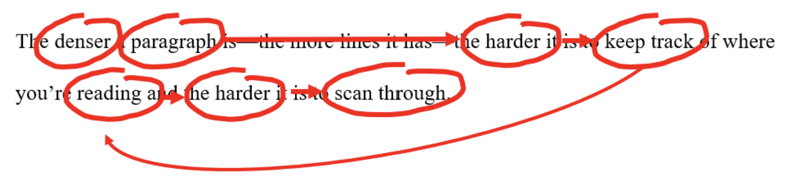
That means that, even for the majority of readers scanning through, smaller paragraphs and standard spacing helps them read this way.
But for readers who might need to read more slowly and carefully, when a paragraph is a page-long and full of complex sentences, it can be very easy to lose your spot, lose the point, miss what you need to do, and leave in frustration.
Use bullet points whenever you can: Which of these formats is easier to read?
There are several steps to developing and curating a welcoming and productive office environment. You can break them down into three areas. The first is your work space, where you keep your computer, notebooks or papers, and anything you need for your day-to-day work. You want to make sure this area is kept clear of clutter and that everything you need is within reach. Second is your guest-space. This applies whether you are working from home and taking video calls or receiving clients in person. Make sure you have at least one chair available for guests, make sure the environment is clean, decorated in non-harsh tones, and well ventilated. And finally, your mind-clearing zone. Not everything in your office needs to be work-focused. Mind-clearing zones can include walking space, a shelf with fidget toys or entertaining knickknacks, artwork on walls and books, or even an exercise ball.
VS
Steps for curating a welcoming office environment:
A) For your work area
Keep your desk clutter free
Keep your notebooks and papers within reach
B) For your guest receiving area
Make sure you have a suitable background for video calls
Keep a spare chair in case of in-person clients
Avoid overcrowding or harsh colors
C) For your mind-clearing area
Ensure you have space to stand and walk around or even exercise lightly
Keep fidget toys or light distractions nearby, but not on your desk
Decorate with things that bring peace and calm
Breaking content into bullet points and lists conveys the same information in a format that is more accessible to a wider range of readers!
Optimize for AI Visibility
“Wait, AI? What does that have to do with accessibility?”
Turns out, more than you’d think!
We’ve probably all had that experience where you go to a website, you’re looking for something, and you’re like, “Okay… but where do I find what I’m looking for? What do I do? How much does it cost? Who do I talk to? How do I get started? What even is this?”
And then you leave, frustrated and vowing to never return.
One of the best recommendations for creating accessible content is directly answering questions. Specifically, the classic “W/H questions” about your website, your product, or your service:
Who are you?
What do you do?
Why do you do it?
How do you do it?
Where do you do it?
When do you do it?
This strategy also aligns with AI optimization. Whether we’re talking about Google’s AI Overviews, platforms like ChatGPT or Claude, or AI-powered personal/workspace assistants like Copilot or Gemini, writing content that answers questions = better visibility.
Strategies for AI optimization that also improve accessibility:
Use descriptive headers: All too often, we rely on pre-set or pre-built website templates that have boring, non-descriptive headers on purpose.
“What We Do” or “Learn More” tell both readers and AI systems very little. When you’re answering those W/H questions, think about the questions your clients or readers are asking themselves and how they might find you when searching for a solution to something.
Be direct and explicitly informative: vague language helps no one. “Our experts are ready to help you achieve your goals” doesn’t say anything about what you do. “We provide quality” or “We’re committed to excellence” don’t say as much as what you actually provide, how you provide it, where and for whom, how much it costs, and what a user needs to do to get it.
I recently searched for a well-known local restaurant that had very little information on its website. The site never clearly explained what it served, what made it unique (it simply claimed the recipe is unique), or what kind of dining experience to expect. Instead, both the website and the restaurant’s social media included several mentions of its established fame.
So what happened when I searched for local restaurants on Google?
The AI Overview recommended the restaurant but it confidently filled in the blanks and got several details wrong. It described items that weren’t on the menu and described the inside of the restaurant in ways that were, let’s say, less than accurate.
Asking questions of your own service, organization, or company helps you get around your own assumptions. From an accessibility perspective, here’s the really powerful lesson: People don’t arrive at your website with your context.
Some visitors are:
first-time customers
tourists
using machine translation
unfamiliar with your field
using voice assistants (many of which have AI integration now too!)
tired or distracted
using a screen reader
browsing on a phone while standing in line somewhere
If your website is written from a position of assuming information, you might be blocking access to that information.
Aaaand also showing up less in AI results or making it harder for it to understand your content too.
In other words: optimize for clarity, and you’ll end up optimizing for both accessibility and AI visibility too.
And those are five optimization strategies you can implement yourself!
Some are as easy as adding some text here and there; some involve increasing the font size or slightly changing your contrast colors for added visibility; some can be done by splitting paragraphs and breaking info into lists; and some are achieved after sitting down and thinking a little bit about how to make your content clearer.
Now your website is more accessible, more welcoming, and more approachable by more people!
🔗 Once you’ve done these accessibility optimizations, consider professional accessibility support for all of these other areas too:
Navigation coding
Audio transcripts
Semantic HTML
ARIA labels
Header tags
CSS optimization